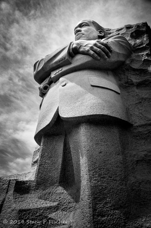
Last week, I began my journey into black and white photography. Well, to be more precise, I began my journey into black and white conversion, that is taking a color photo, converting it into black and white in Lightroom, and then post-processing that image for what I perceive to be the best result. And I have to admit, this is much more difficult than it seems.
The first hurdle is choosing a color photograph that will work well in black and white. I’m learning that the conversion works best with a photograph where form and light are the dominant elements.
Form, as opposed to shape, is what gives an image a three-dimensional quality. Think of shape as focusing on the outline of an object and form as focusing on the subtleties of light and shadow that make the object stand out from its environment. Light helps to define form: one needs to find an angle where light creates the shadows that define the contours of the object.
The photo of the Martin Luther King, Jr. Memorial was one where I purposely took into account form and light when shooting the image. By crouching down slightly to the right of the statue and shooting upwards, I was able to capture the shadows cast on the right side of the statue, as well as those underneath the crossed arms and the hemline of the suit jacket. This all worked to give the photo the three-dimensional feel I was going for. (I also love to shoot statues from below to give them a “towering” feel.)
Once in Lightroom, however, I faced a multitude of hurdles, as the choices of how to convert and best post-process this photo were endless. I’m typically pretty decisive about what looks good to me in a color photo, but not so with black and white. I had many virtual copies in my filmstrip, going back and forth between them all, until I finally settled on the one I’ve posted here. Once again, for those interested, a brief description of my choices:
- Converted the photo to Black & White via the Basic Panel.
- Increased the whites just to the clipping point, then decreased the highlights a bit to make sure to get the maximum amount of highlights without clipping any away.
- Decreased the blacks to counteract any washout.
- Cranked up the contrast (+74) to accentuate the blacks and whites.
- Increased the clarity (+38) to punch up the midtones.
- Added two radial filters:
- An oval filter encompassing the statue, used to decrease even further the exposure of the surrounding area. Placement of the filter (the top 3/4 of the statue plus the negative space above it), also served to add glow to the face and to a bit of the area above it.
- A round filter on the face of the statue, increasing the exposure and clarity just a bit and removing a bit of shadow.
- A hint of sharpening.
- And, always, a bit of post-crop vignetting.
And so my learning curve continues…
Many thanks to Leanne Cole and Laura Macky for sponsoring Monochrome Madness
and contributing to my education as a photographer. You can view all the submissions for Week 9 later today on Leanne’s blog.


No doubts, this is much better than your previous Before and After post. All those elements you’ve mentioned here (and you took into account, while conceptualizing the image) produce this striking picture. Congratulations Stacy, I’m glad to witness all this progress!
LikeLike
Jaime, you are definitely playing a part in my progress! I know it will be a two-steps-forward-one-step-back progression, but that’s what makes learning such a great adventure. Thanks, as always, for your comments and your support!
LikeLike
Your words, and your enthusiasm, are so touching and make me feel very happy! Keep on that way; sooner than late, I’m sure you’ll change the rhythm for just a two-steps-forward every time!
(By the way, I sent you an email to your gmail address)
LikeLike
This image is outstanding Stacy! Wonderful angle of shooting and such great work with converting it to b&w! It’s cool you described your workflow in Lightroom. Very interesting to read. 🙂 It’s great to see the color version also and see how much better this image looks in monochrome. Really well done Stacy!
LikeLike
Elina, I am honored you like the image so much and glad you find the workflow details interesting. I am always intrigued by before and after shots, and that’s why I decided to include mine on my MM posts. I’m toying with the idea of a weekly before-and-after post where others can join in with their images. I think it could be fun, as well as educational! Thanks so much for your wonderful comments!
LikeLike
Sounds like a great idea… I agree it is so interesting to see before and after. 🙂
LikeLike
Nice! The B&W one has more presence.
LikeLike
Thanks! And, yup, I agree. In my other b&w versions, I didn’t crank up the contrast nearly as high. I ended up choosing this one because of the greater visual weight the higher contrast gave the image.
LikeLike
Very nice. It’s always interesting to see how someone else processes heir images. Great job, as always.
LikeLike
Thanks for you comment! I love seeing before and after photos too – I think it’s a great learning tool. I’m actually thinking of hosting a weekly or perhaps bi-weekly forum where others can submit before and after shots. Perhaps I should put together a poll to gauge interest …
LikeLike
Hi Stacy. I really like what you did here and thanks for sharing your process. This time I am more fond of the b&w.
LikeLike
Thanks, Karen. I do like the drama of the b&w for this image.
LikeLike