
 Highlighting the creative magic behind post-processed photos
Welcome to ABFriday’s monthly One Photo Focus! This month, 25 photographers are sharing their post-processing interpretations of one “before” image submitted by Manal Ali of A Single Shutter. I am so excited to share these wonderful images with all of you!
We begin with Manal’s “before” image, followed by the “afters,” and at the end, a gallery of all so you can watch the changes as you scroll through. Be sure to click the links to each participant’s blog as many have written posts “uncovering the magic” behind their “after” images. And if you would like to participate in the March One Photo Focus and/or ABFriday in general, you’ll find all the details on the After-Before Friday Forum page. Come along and join this zany bunch – we’d love to have you!
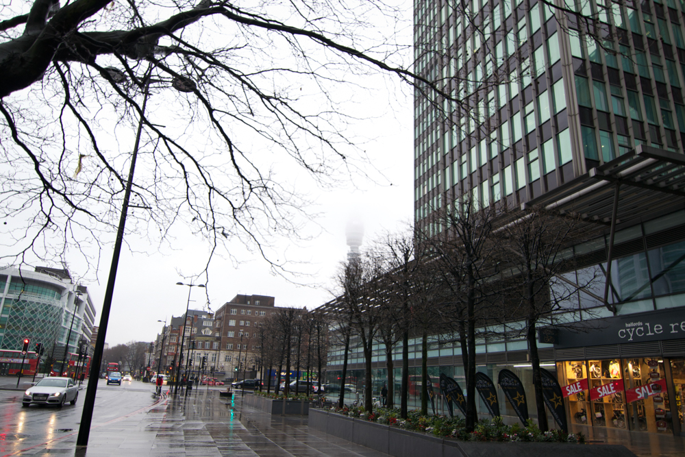
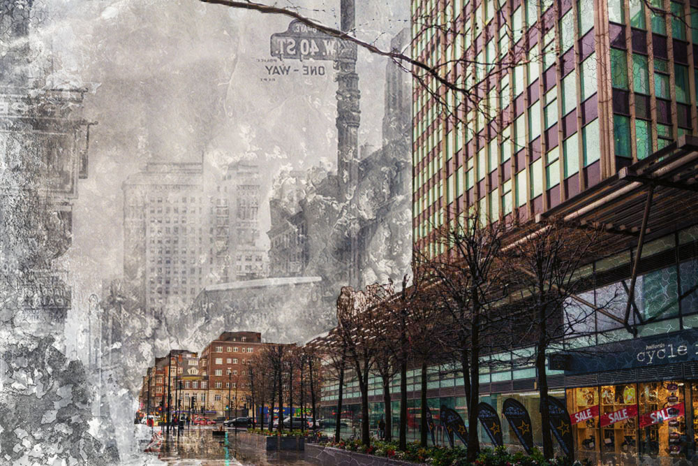
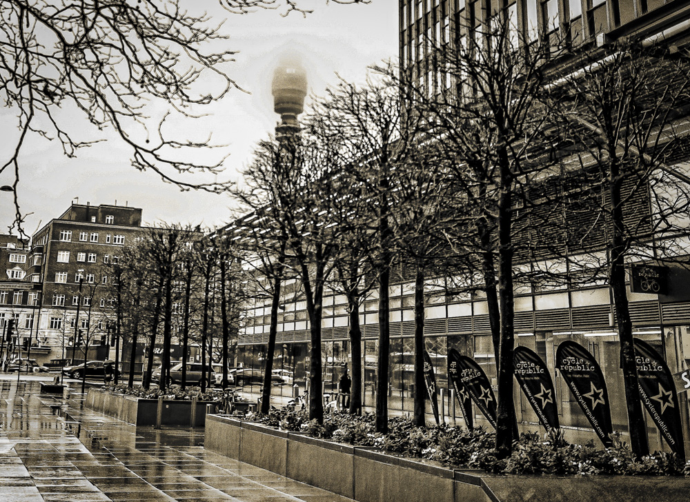
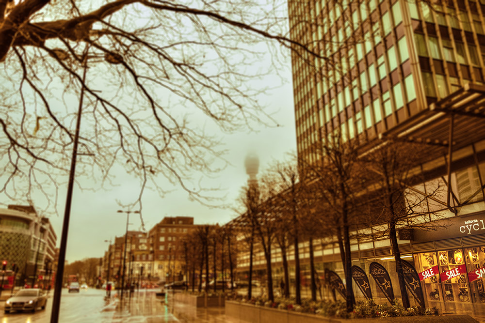
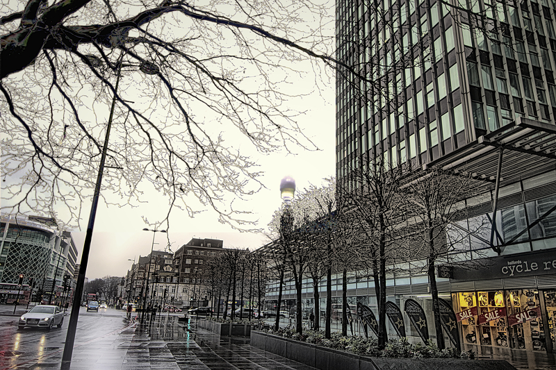
Submitted by Manal Ali — A Single Shutter
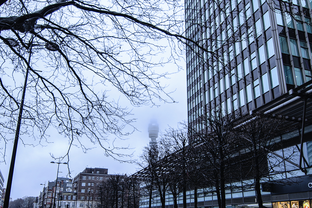
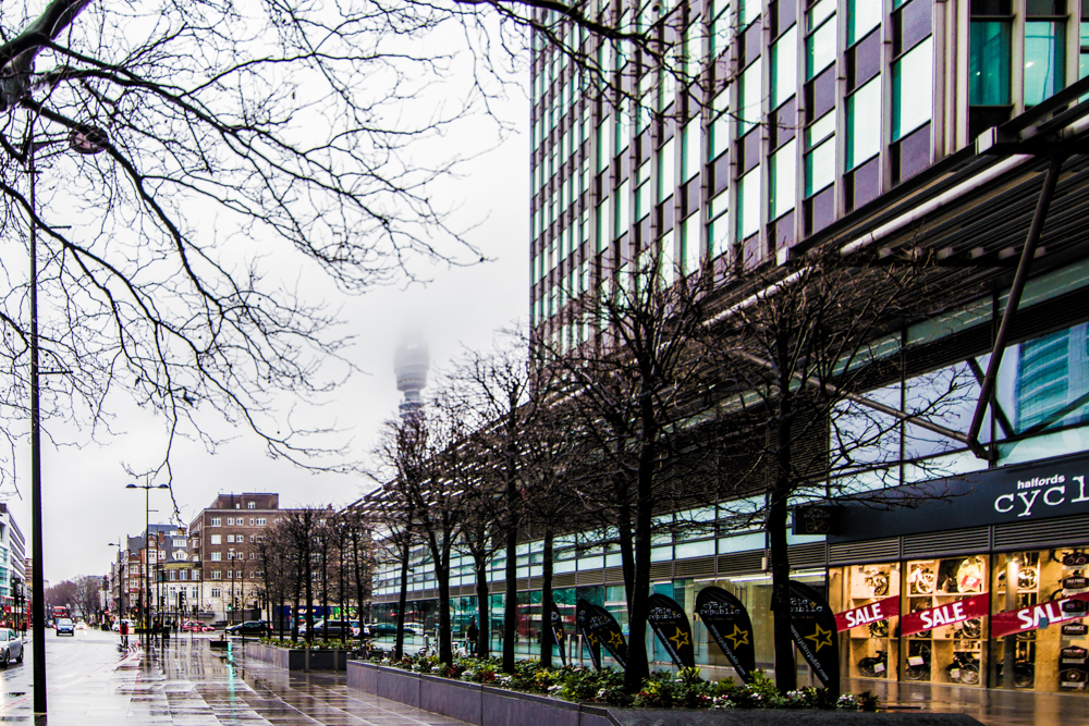
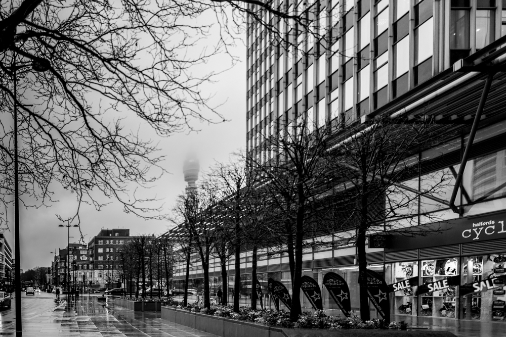
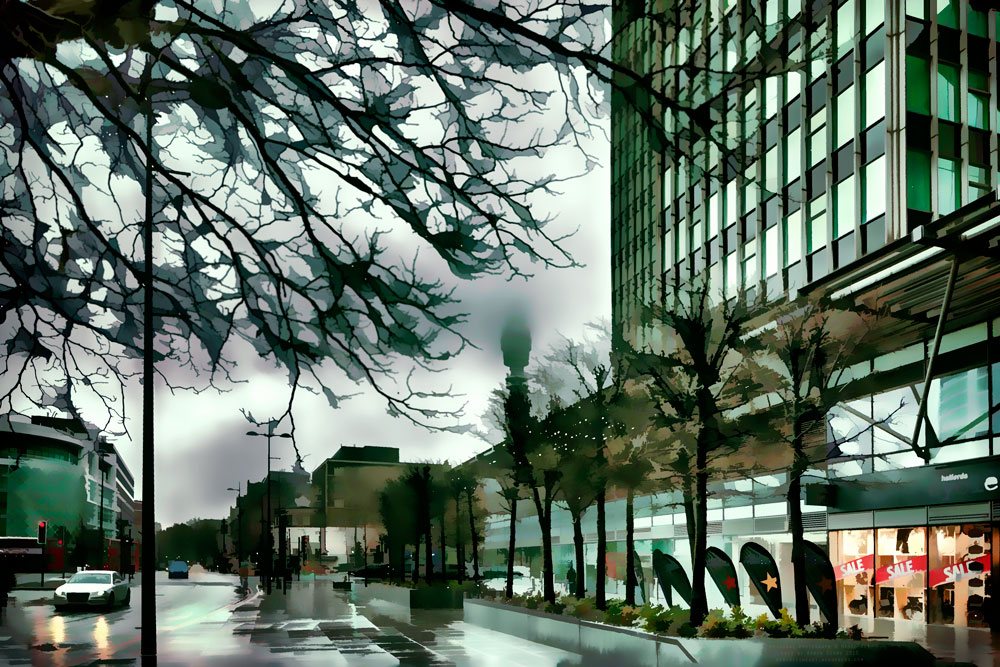
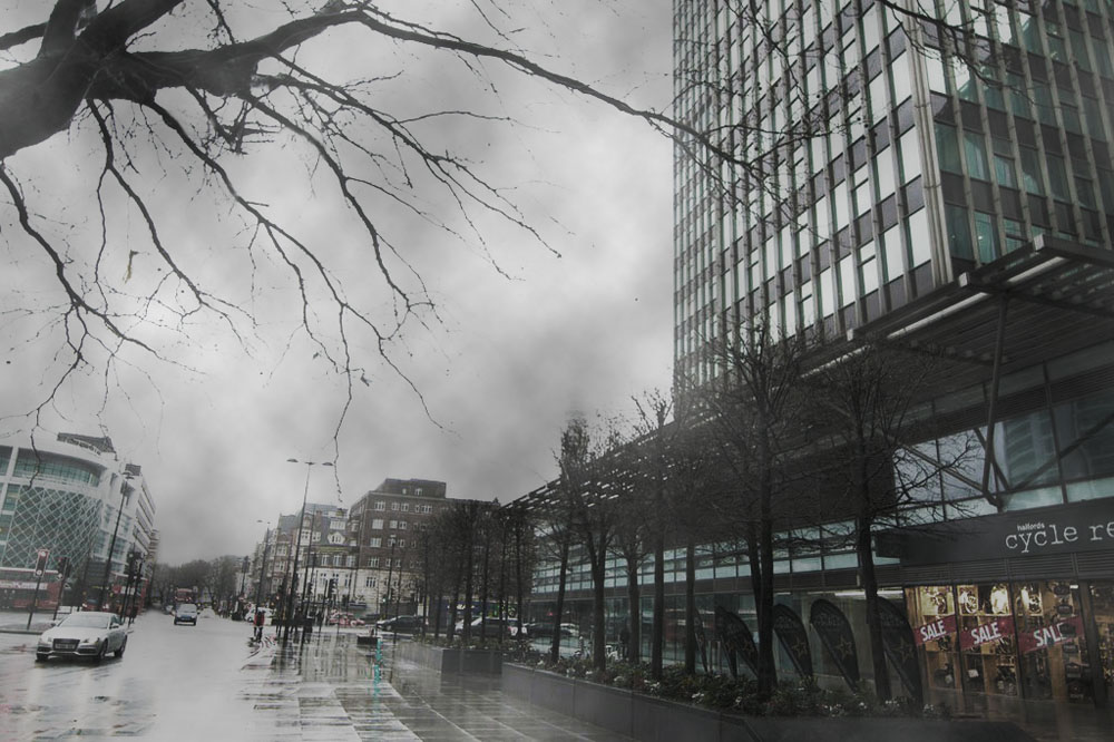
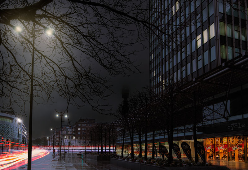
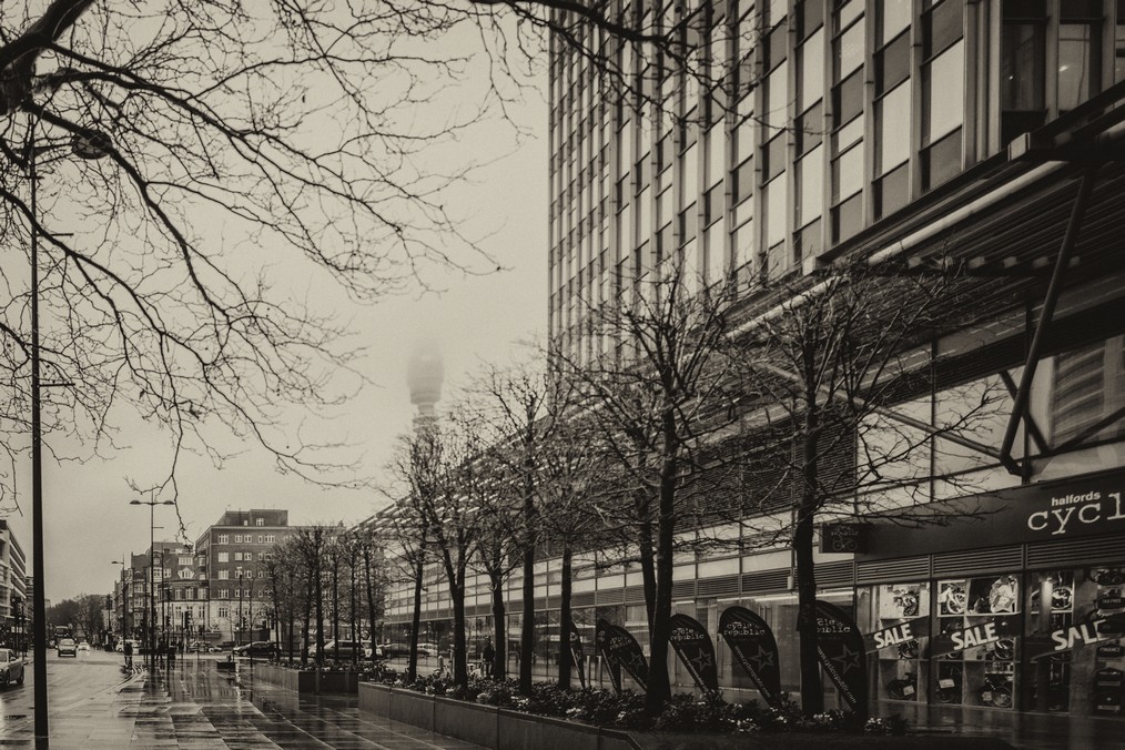
Submitted by Stacy Fischer — Visual Venturing
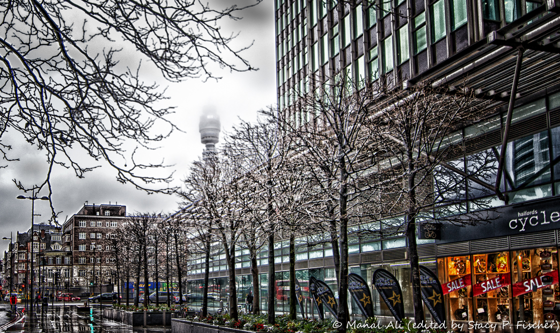
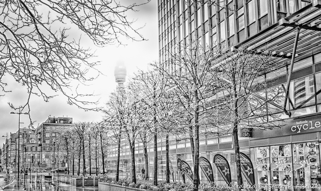
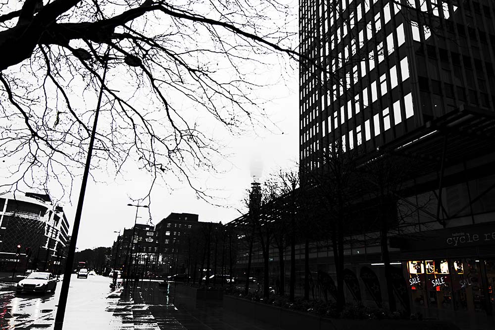
I have had so much fun working with Manal’s image. I reached into Lightroom’s magic bag, and coupled with Nik Color Efex and Silver Efex, I aimed for directing focus on the BT Tower. Presets, lens correction tools, gradient filters, radial filters, and post-crop vignetting all contributed to the final products. In the color image, I wanted to keep the overall feeling of the cloudy, rainy day. And because I love black and white, I had to then give that a whirl and loved the line drawing effect that resulted. Thanks, Manal, for submitting a fantastic image to work on!
Submitted by Laura Macky — Laura Macky Photography
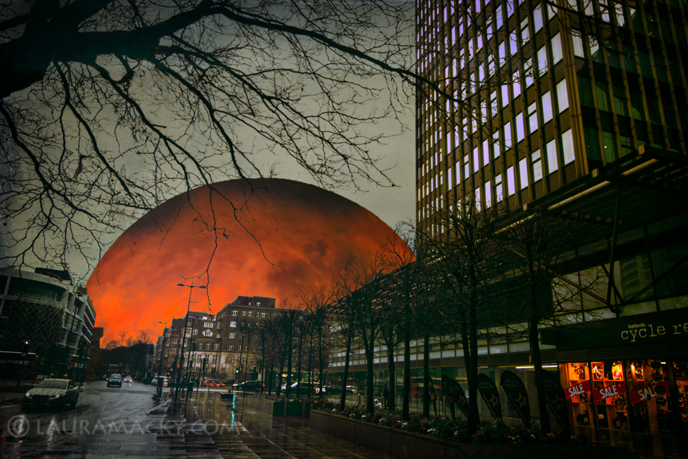
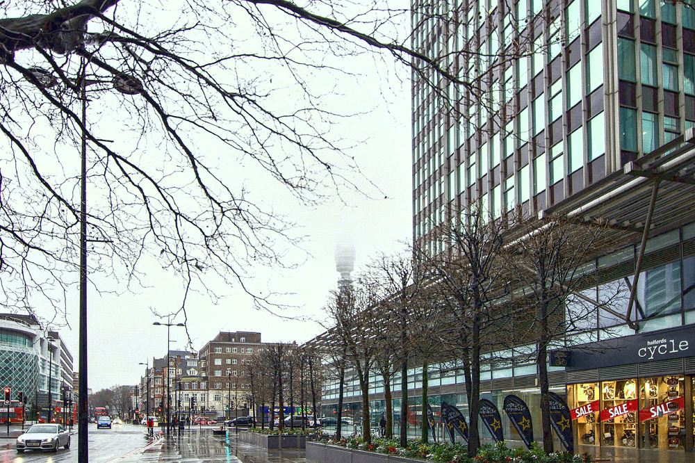
Image courtesy of Manal Ali
Submitted by desleyjane — Musings of a Frequent Flying Scientist
Submitted by Robyn — Captivate Me
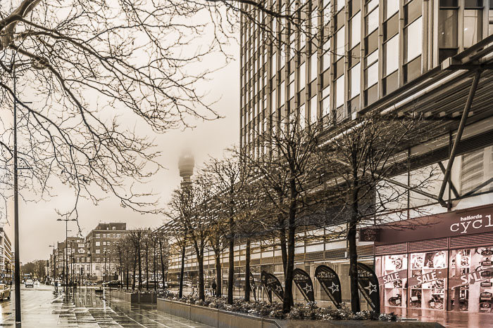
Submitted by Nancy Merrill – nancy merrill photography
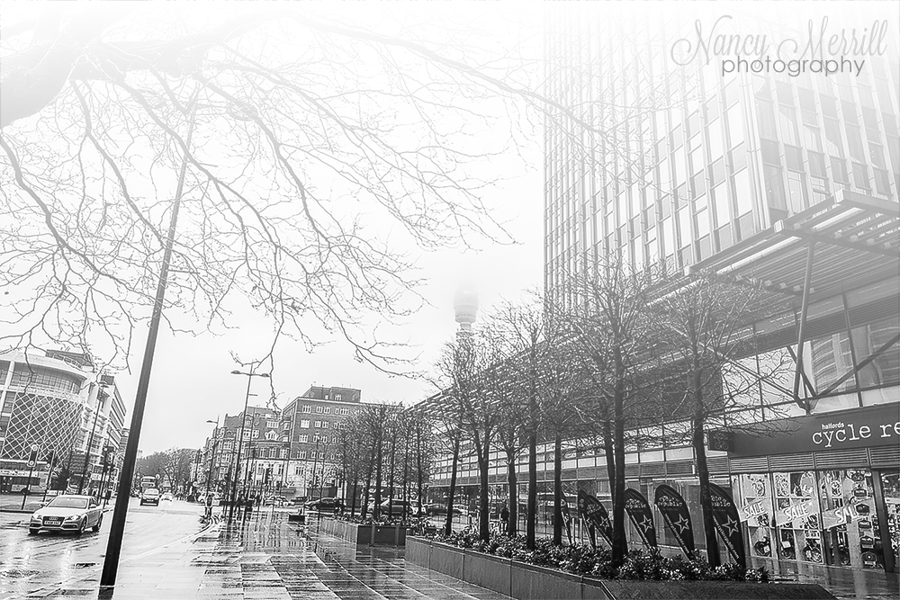
Nancy says: Before changing the image to black and white, I lightened it and heightened the contrast and saturation. After changing the image to black and white, I sharpened the image and then increased the fog haze with a gradient layer. Very fun!
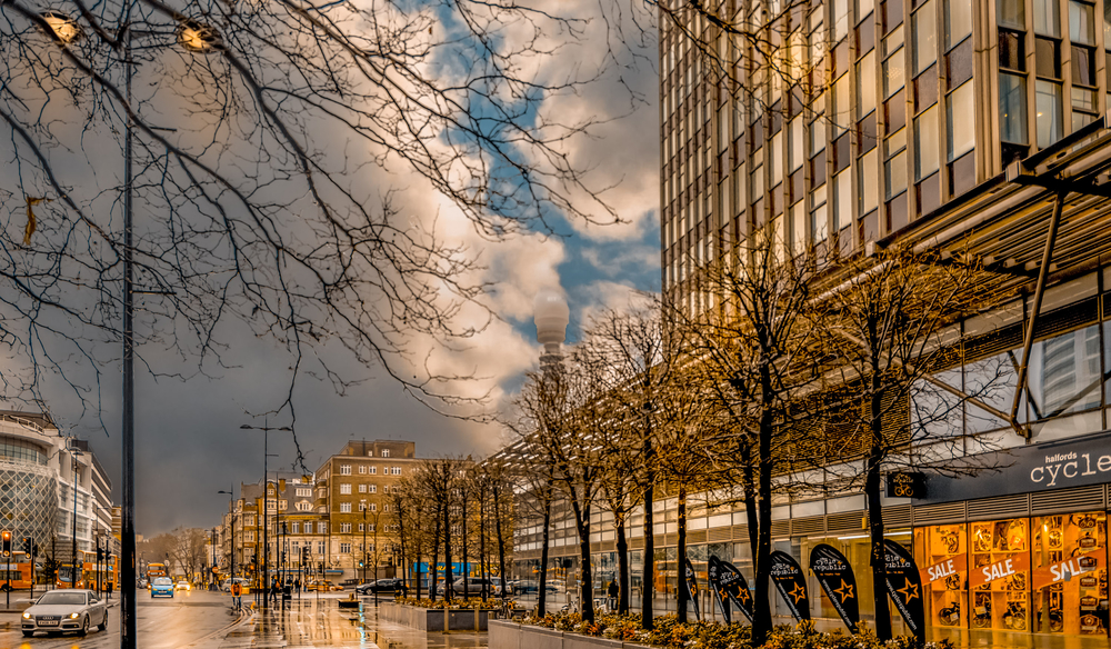
Submitted by Nic Anderson — Photography by Nic
Nic says: I tried to make the image feel blue and gloomy but also wanted to get a hyper HDR look too. I added a blue wash to the image, then I played around with several sharpening techniques and then played with the saturation. I did my initial raw edits in Camera Raw, then I did the major edits in GIMP. I think it looks pretty cool. I didn’t even notice the red double-decker buses in the background until I made these edits!
UPDATE: I received an email from Nic asking if I could please update her picture as she had learned how to adjust the vertical perspective. (Good for you, Nic!) Between our time difference, we had a number of crossed emails prior to publication of this post. As a result, Nic, I am posting both versions, until I hear from you that I can go ahead and post just the updated version 🙂
Submitted by Stacey/Lensaddiction — Learning to See Light
 Stacey says: Thanks to Manali Ali for a very challenging image this month, I embraced the After Before concept and imagined a city street as it had been and as it was now. My PS skills are very much beginner stage so I had to work hard at this one.
Details on how I did it on my blog post.
Submitted by West — west517, the world we know
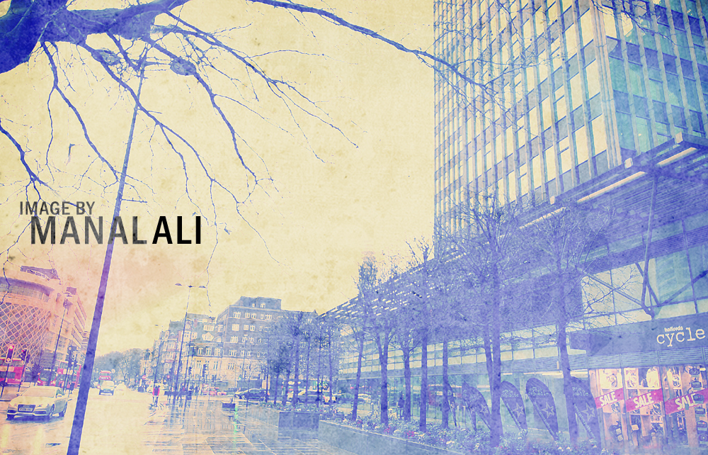
West says: This is my first submission to Stacy’s “After Before” post. I enjoy them every week and decided to take the challenge and step into the ring. Inspired by winter whites and downtown blues, I wanted to process Manal’s image using several vintage filters and layer overlays that I created using Adobe’s Photoshop. Mixing a vintage vibe with a city-chic watermark (I hope you don’t mind Manal), I wanted to highlight the old/new atmosphere that defines most cities today.
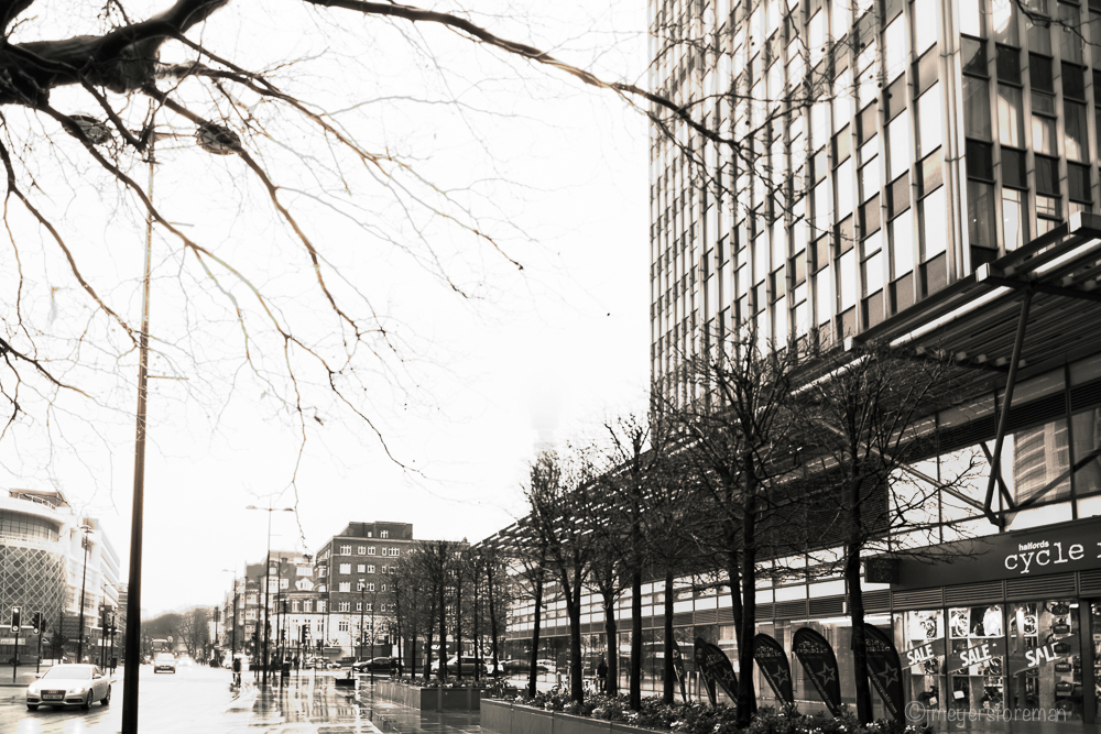
Submitted by Janice Meyers Foreman — jmeyersforeman photography
Submitted by Loré Dombaj — Snow’s Fissures and Fractures
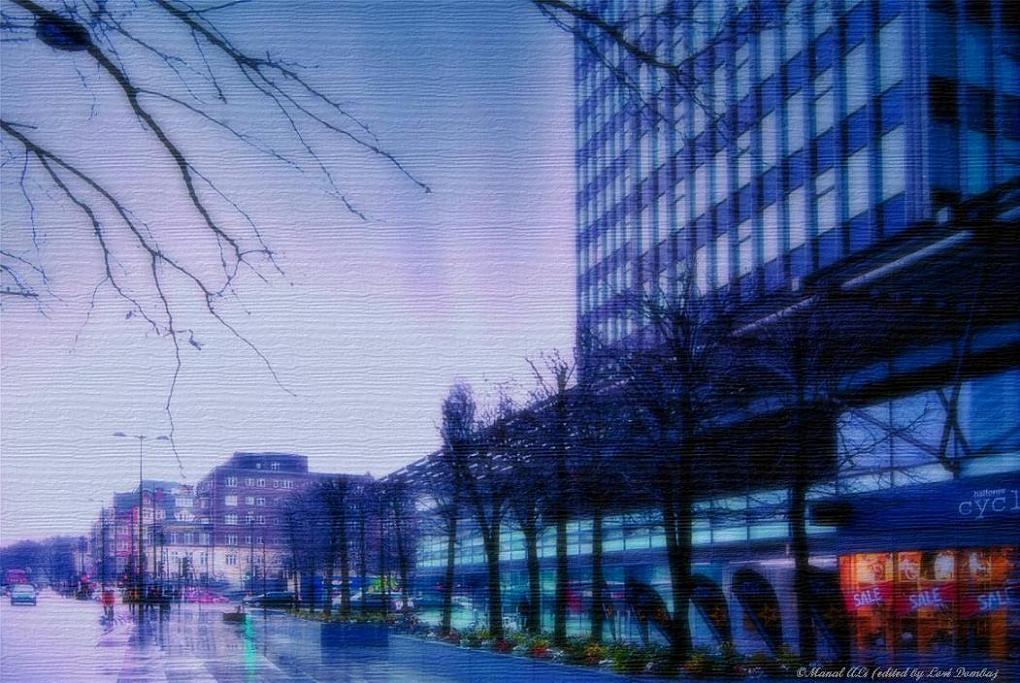
Loré says: I played and I played and this is what I came up with.
Submitted by Amy — The World Is a Book
Amy says: I used Lightroom but don’t really remember the process. I have been working on it back and forth several times. 🙂
Submitted by Marsha — Coolquilting
Marsha says: Intention: to straighten the photo and remove the very bright white sky but not to destroy the rainy look. I don’t know how to adjust just the sky so I settled for some subtle changes via textures and filters to the whole photo.
Processes used were both desktop and iPad applications: LR preset for increased clarity, straightening in PS and SKRWT, TouchRetouch to remove plastic bag in the tree, assorted textures and filters in PSE, Pixlr and Snapseed.
Submitted by Cee Neuner — Cee’s Photography
Cee says: I wanted to warm it up a bit, since it looked so very cold, weather wise.
Submitted by Emilio Pasquale — Photos by Emilio
Submitted by Kaz G. — daysandmonths
Kaz says: Well, it’s been an exercise. I tried to change the photo in different ways (cropping, etc.) but wasn’t happy. I even thought, “Hmmm, too hard this month and simply should give up…”
Then I had a thought and fiddled around some more and here it is. My take on this month’s shot. I wasn’t sure what to focus on and had trouble with what I wanted to “say” in the photo. I should have gone with my instincts at the start when I saw the sale sign, so that’s what I’ve done.
Submitted by Michelle Lunato — Michelle Lunato Photography
Submitted by Benjamin Rowe — Aperture64
Submitted by Katie Prior — Drawing with Light
Submitted by Lynne Ayers — Beyond the Brush Photography
Lynne says: I liked the wet reflections on the sidewalk and wanted to keep and enhance that if I could. I didn’t like the semi-visible light standard to the right of centre and wanted to either get rid of it or enhance it. What I did is available here.
Submitted by Sara Poyfair— sarapoyfairphotography.com
Submitted by Karen Chengelis — KCinAZ
Karen says: Thanks Manal Ali for providing such a wonderful challenge. I’m not sure about the rest but this one was another big learning experience and made me put my mind to work. Read what I did on my blog post.
Submitted by Jaime Perez — My Photolanguage
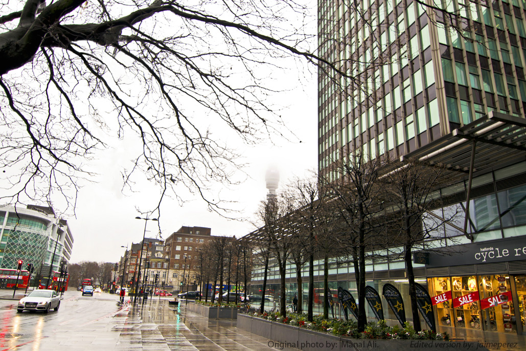
Jaime says: This time, we have a simple, vertical-and-horizontal-lines-based composition, but complicated image to work with in edition due to the so many elements present in it. So, having neither much to do with the rest of the image nor any other creative inspiration, I tried the hardest way. Long time in Ps CS3, little by little (just what I really hate!), trying to get what I suppose it was the first thought of many of us who participate this week.
Hoping you all like the result and looking forward to see the rest of audience versions, I want to say that I’m very happy participating in this new version of Stacy’s wonderful forum.
I’ll see you next time!
Submitted Max — Max 510.com
Submitted by Nancy / dogear6 — Living the Seasons

Nancy says: Manal shared such an interesting photo for this week! Although the sky was a challenge, I wanted to preserve and highlight the bright colors in both the foreground and background of the photo. I made adjustments in Lightroom to the usual highlights, shadows, contrast, etc.. Once I brought up the colors and detail, I took it into Photoshop. I began by correcting the keystoning on the sides, making the building straight to the right edge and the lamp post on the left. I experimented with cropping to bring out the buildings in the back, deciding that the sky and left side of the picture needed to go, including the lamp post. This really focused the photo to the jumble of details and colors that I wanted highlighted. I used Topaz Restyle to bring out the grays, blacks, and greens, then applied Topaz Adjust to accentuate the details and put a simple border around the photo. More detail on how I did this is on my blog here.


 Nic Anderson, Photography by Nic")


Please click on the links of those who contributed this week, to read about their post-processing steps and/or to see what other treasures they have on their blogs. They’d love to have you visit!
So what do you think of the ABFriday forum?
Feel free to leave your thoughts and suggestions in the comment section. And don’t forget to view the guidelines if you want to participate. I’d love to have you onboard!

These were great! Each month shows so much creativity. I agree with Emilio that you deserve a big thank you for organizing this and putting it together. It looks great and I learn so much seeing what everyone else did.
I love Robyn’s edits the best (I did last month too). She really thinks outside the box. In fact, I don’t think she knows where her box went to. I’m heading over there next to see what all she did.
Nancy
LikeLike
Great comment about Robyn! And thanks for your thanks 🙂 Having everyone excited about participating and enjoying the process makes the behind-the-scene works fun!
LikeLiked by 1 person
That makes it much more fun plus the fact that we’re not seasoned professionals competing against each other. There’s a lot of blog hopping to see each other’s work and leave encouraging notes. I think that’s just as much fun as doing it.
LikeLike
Nancy, you just made me smile … you’ve described the essence of ABF/1PF perfectly! 😀
LikeLiked by 1 person
OK, I’m back. Just finished looking at your video and I really love that part of your post each week. Don’t ever lose it. Well, we certainly have a lot of versions this week and a lot of new techniques. I have so many favorites. Best not to divulge which ones 🙂 Anyway, I like your color version much better than your b & w “sketch” only because, for me, it was a little too bright. I think a darker shading would have improved it FOR ME! Not necessarily for any one else. I’m surprised that there was so much texture in the sky- I never even looked for it. And I like your decision to crop. In my editing I never really think about what should be the focus. You have taught me to consider that, instead of just randomly adding colors and clouds and flashy highlights. Thank you!
LikeLike
Thanks about the video(s), Emilio. I find those the most difficult and time consuming part of the process! So I’m really glad you like them 🙂 As for the cropping, after looking at all the other images and looking back at mine, I began regretting removing the street traffic from the image. It gave another whole dimension to the image. I was so focused on the BT Tower, that that clouded my vision. Not necessarily a bad thing, just different. Of course, with my own images, I’d like to say I compose in camera and don’t ever need to crop (yeah, and if you believe that, I have a bridge to sell you), but since that isn’t always the case, I do tend to crop my photos, sometimes going through quite a few variations to help bring focus. And that process is pretty interesting and instructive, as it turns out. Anyway, my goal is to rely on that function much, much less in this coming year!
Thanks, too, about your comment on the B&W – I actually thought the texture in the sky could have been a bit brighter (aka more subtle) instead of having those blobs of grey depicting the texture that was there. 😉 As you say, to each his own, but it is fun to hear the differing views!
LikeLike
I almost always crop. I usually prefer a more panoramic look to my landscapes. But I don’t think I did any crop on Manal’s image.
LikeLike
Panorama’s good 🙂
LikeLike
Great edits Stacy, I love the b&w line effects. I’m a fan of contrast and it looks great in you two versions. Thanks again! I’m off to look through the others…
LikeLike
Thanks, Desley! It was fun to see you do both color and B&W too (I swear, I didn’t pinch that idea 😉 – you know me and B&W images!) I seem to have a “thing” for a pencil sketch approach 🙂
LikeLiked by 1 person
LOL yah I like the pencil sketch look too. More experimenting to come!
LikeLike
🙂
LikeLiked by 1 person
Hi Stacy, so may great edits, so much to read! it is going to take me all week to get to them…
LikeLike
Ha! I know, Janice, right? 🙂
LikeLike
Goodness Stacy, so many great and really different edits this month. Thanks so much for hosting it, it must be quite a lot to put together now! I will have to look through them all in stages there are so many! I really like both your edits, though I think I like the colour one best. 🙂
LikeLike
Thanks, Katie. Yup, I’m definitely needing an organizational workflow to keep on track! And I like the color one best too 🙂
LikeLiked by 1 person
Ciao a tutti !
Great job of everybody friends !
Very nice the idea of Nancy !
See you next month ! 😉
Max
LikeLike
Looking forward to it, Max!
LikeLiked by 1 person
Working with others on the same project has always been something I enjoy 😃 So many fantastic variations on a theme. Fun!
Thanks for hosting Stacy and thanks to Manal 😃
LikeLike
Thanks for your support, Robyn! 🙂
LikeLiked by 1 person
I’m a bit more awake now 😉
Stacy wanted to tell you, I enjoyed your own interpretations of Manal’s image – I like both and that ‘almost’ touch of snow on the trees.
LikeLike
Really great bunch of edits by all. I thought the image was great for the forum because it pushed everyone’s editing skills.
Thanks Stacy for hosting and organizing us all.
LikeLike
I absolutely agree, Ben! I’ve learned a great deal today. And you’re very welcome 🙂
LikeLiked by 1 person
So many wonderful interpretations. It’s so interesting how so many different visions arise from the same photo.
LikeLike
It IS fun, Lynne 😀 And I always learn something from each!
LikeLiked by 1 person
Wow, everybody. All I can say is wow! Of course, I want to say more to everybody individually- and will later today- as I was so blown away by all the imagination and talent here. I remember not to long ago Stacy, you made a comment about so few people joining in the fun. Well what do you have to say now? I bet you had some fun putting this week’s post together considering all the submissions! It’s early here in the west so let me start the day and I will be back later with my thoughts on your image specifically. Will you mind if I comment twice today?
LikeLike
You can comment as many times as you want, Emilio; I don’t mind at all 😀 And, yup, One Photo Focus seems to be a fun playground for all (yay!). After last month’s entries, I had to get myself really organized with folders in my email, my saved photos, and even went so far as to create blog templates so that it would be much easier to plug submissions in!
LikeLike
Well, hope I didn’t mess you up too much. And at least I labeled and re-sized this time!
LikeLike
Nope, didn’t even come close to a “You big pig” remark 😜😉
LikeLike
Stacy I liked that you cropped the photo. Wonderful work as always. 🙂
Such a great group of talented artists on display.
LikeLike
Cee, as I commented on your post, now I think I overdid the crop. Stuck too much to focusing on the BPTower when it would have been nice to incorporate more of the street life on the left. And I came to that realization after seeing how much that part of the image added to everyone else’s image. Always a learning experience 😀 I’m always blown away by everyone’s differing visions 😀
LikeLike
So fun to see what everyone did with that image. I stared at for a while, but had no inspiration. So, I had to do a pass this week.
LikeLike
Sometimes that happens, right? Thanks for taking a look though, Mary 😀
LikeLiked by 1 person
Wow…so many different effects. I am really looking forward to doing this next month…when I will be a bit braver with my edits!!!!!
LikeLike
Loved your photo this month, Marsha. I’m looking forward to seeing what you come up with on Loré’s photo (who’s up next) 🙂
LikeLike
Love seeing all the results.
LikeLike
Me too 😀
LikeLike
Great edits, my compliments to each of you.
LikeLike
Hey, David! Thanks for taking a look and leaving a comment. It’s a fun, interesting process 🙂
LikeLike
I follow both this blog and A Single Shutter, so this was a TREAT!
Thanks, everybody who contributed!
LikeLike
Thanks for following Manal’s link and visiting! She gave us a great challenge this month, didn’t she? 🙂
LikeLike
So wonderful to see all the after here! Great responses. Thank you, Stacy! 🙂
LikeLike
You’re very welcome, Amy. Thank you!
LikeLike
Wow, so many great images, I am really impressed. Mine looks like a cheap supermarket “paint it by numbers” version. 😛
LikeLike
See my comment on your post, Loré, begging to differ 🙂
LikeLiked by 1 person