 Highlighting the creative magic behind post-processed photos
Many thanks to this week’s 7 participants (spiders and all)! If you wish to join in, guidelines are on the After-Before Friday Forum page.
My submission: The photo I’m showcasing this week is one I shot playing around with long exposures using my tripod. I used some black cutting boards for a makeshift background and then used Lightroom to complete the effect. It’s amazing the fun photos to be found around the house!
I took a shot of this book from a different perspective and processed it in black and white. Vote in a poll for which version you like better (as I just can’t seem to make up my mind!).
Submitted by Robin Kent — PhotographybyKent
Robin says: Nearly always, my goal in post-processing is to create an image that is a close representation to what I was seeing when I was on the scene making the photograph. But every so often, I am tempted to create a scene the way I wished it had been. Such is the case with my submission to Stacy Fischer’s After-Before Forum this week. The “Before” image here shows the original RAW image of the Washington Monument in the late afternoon of early March 2013. An incredible shaft of golden sunlight was illuminating the monument as the dark clouds of a clearing storm moved toward the east. It would have been perfect had this occurred a few weeks earlier, before the scaffolding and fencing for the earthquake repair had started to go up. The “After” image shows the scene with the correct lighting on the monument and the correct darkness of the clouds, but the scaffolding and fencing has been radically changed—it is mostly gone. Details on the post-processing can be found at my post. As always, many thanks to Stacy for hosting this Forum.
Submitted by Leanne Cole — Leanne Cole PHOTOGRAPHY
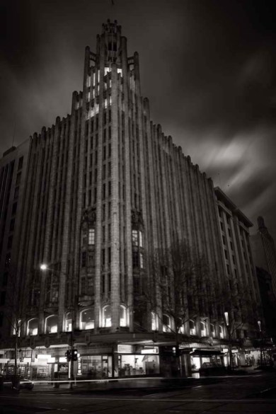
Visit Before with Tram lines, After Without on Leanne’s website, Leanne Cole – Fine Art Photographer, to read about her image.
Submitted by Jaime Perez — My Photolanguage
Jaime says: This time I wanted to finish my last submitted work, from week 16, and just turned the same image into Black and White. Why B&W? Well, I think this would give a classic and more realistic aspect to the image than that, more fantastic or surreal, of the previous one. Otherwise, B&W version dissimulates (even more) an important detail more noticeable in the color one. What do you think? Are you able to notice it?!
Submitted by Loré Dombaj — Snow’s Fissures and Fractures
Loré says: The post-processing was a nightmare, I just couldn’t get what I wanted. First I ran it through the GIMP, removing the leash and balancing the colours. Yellow was a particular b#%”$, it was so hard getting the right yellow for the flowers, without turning the entire image into a yellow mess. I really didn’t like the results I was getting. Then I went out for a walk, returned and discarded all the work, starting from the beginning. Same steps led to slightly better result, but it was still a bland image. I was running through all the tools in GIMP faster than Usein Bolt. I wanted to create the window with my Berta in the focus and everything else blurry. Finally, I ran the image through my good old friend PicMonkey (they should really pay me for the promotion) and played around, until I stumbled upon a solution. I sharpened the image almost to the maximum which gave me good results on the dog and the grass, but everything else was awful. Than I used “Focal Soften” which gave me the final result. Some will say – too much work, I say – you’re right. By the way, I flipped the image just so it would look cool in Stacy’s post.
Submitted by Karen Chengelis — KCinAZ
Karen says: I’ve continued to explore post processing in Lightroom using tips from several Blogs in WordPress. One tip came from M.Funk Photography’s Blog in a tutorial video on “Retouch an Underexposed Sunrise.” He suggested making sure to balance luminance and sharpening so that they equal 100, along with several other tips. I was equally impressed with PhotographybyKent from After-Before Friday – Week 17 where not only was the final image stunning, but the visual tips that Robin provided were great. You can read more details about my post-processing here. Each week I learn more and more from the After-Before Friday posts in the Visual Venturing Forum.
Submitted by Katie Prior — Drawing with Light
Katie says: My image this week is one I took at a classic car rally last weekend. Using some simple editing techniques in Lightroom I wanted to add a bit of colour and contrast to this image of an old Mercury Monterey to try and replicate what I saw rather than what the camera flattened it out to! I think that I was going for a kind of “retro” feel to the image to match the old Americana type subject.
Submitted by Benjamin Rowe — aperture64
Ben says: No Photoshop this week, all in Lightroom. Hope you aren’t scared of spiders.
Stacy’s Note: Yes, Ben, I am! 🙂
Please click on the links of those who contributed this week, to read about their post-processing steps and/or to see what other treasures they have on their blogs. They’d love to have you visit!
So what do you think of the ABFriday forum?
Feel free to leave your thoughts and suggestions in the comment section. And don’t forget to view the guidelines if you want to participate. I’d love to have you onboard!


Hi Stacey, another great blog – so much to learn, and some (at least for me) new blogs to explore and photographers to learn from, I feel a little like I have fallen off the track, and struggling to stay connected with people and for that matter my own blog!!!
LikeLike
Janice, thanks for reaching out through the forum – it’s always fun to hear from you, but no worries if time passes – I can absolutely relate about struggling to stay connected and up-to-date!
LikeLiked by 1 person
Love what you did with this shot. Thanks for the heads up on the targeted adjustment tool, you’ve explained it really well in your video. You mentioned about setting white points, I’m going to have to look that up also, it sounds like its something basic that I should know about. Both (B&W and colour) images are really striking, but I prefer the colour image, I like the POV better and the red spine adds that little bit extra! 🙂
LikeLike
Glad to help, Katie (though admittedly I’m still learning about all that Lightroom has to offer!). Thanks for “voting;” though sadly it seems the red lovers are in the minority. Last I looked at the poll, it was 70% to 30% in favor of the B&W 🙂
LikeLike
Loved your image this week, Stacy. Combining two things I like most, photography and writing. You did a very good job, not only in colors, but in the sharpness of the after image.
LikeLike
Thanks, Loré! I had a lot of fun and loved using my friend’s D7000 🙂
LikeLike
Another excellent forum Stacy. Thanks for keeping it going. I really like what you did with the book.
LikeLike
My pleasure, Robin. Thanks for always contributing! Glad you liked the book – different kind of shot, but it was fun experimenting.
LikeLiked by 1 person
Love this idea, some great images….one day, when I have some time, I’ll play along 🙂
LikeLike
I definitely understand about the time factor, Sue, but we would love to have you whenever you’re able! 😀
LikeLike
Thanks, Stacey, you’ll need to be patient!
LikeLike
I can do that 😉
LikeLike
Sorry about the spider, but I have a lot more photos much closer up. Like the work on the book, the red really draws the eye in with the rest of the image monochromatic.
LikeLike
Just giving you a good-natured hard time, Ben. If you send me close-up photos of the face of an insect, though, forewarn me in the subject line 😉 And glad to find a fellow lover of the red in the book.
LikeLike
Thank you so much for the video, Stacy! That is a lot of effort to put it out in video for us to learn. Video learning is effective, but it takes much time to make. I haven’t use some of the features as you are showing us. This really is helpful. I shall try to do a before and after next week. I’m excited…
Have a great weekend! 🙂
LikeLike
Glad you liked the video, Amy 🙂 I have been helped by many video tutorials, so I thought they would be a nice addition to the forum. And I’m happy you’re excited about the Forum! We’re excited to have you 😀
LikeLike
Great ABFForum week Stacy, congrats! And congrats to all the participants, good works!
You did a magical work with that book; I feel it like “Back to The Future”, from the romantic-classic- sepia tone of ancient-traditional-library books to the pure-postmodern-white of tablets digital books; excellent!
LikeLike
Ooh, I like that comparison, Jaime! And, I agree, all wonderful and thought-provoking posts this week! Such fun 🙂
LikeLike
I always enjoy seeing these. One day I have to remember to enter it. 🙂
LikeLike
Would love to have you join in, Cee 🙂 In the meantime, I’m so glad you’re enjoying the Forum. Thanks!
LikeLike